

NDVI explained: how to read a vegetation map
This guide shows how to read an NDVI change without treating a colour as a diagnosis. The map below is an educational illustration, not a customer result.
What NDVI measures
USGS describes NDVI as a measure of vegetation greenness. It compares near-infrared and red reflectance. Healthy green vegetation typically absorbs red light and reflects more near-infrared light, but the measured pixel can also contain soil, shadow or other cover.
Read the legend before the colour
NDVI normally ranges from -1 to 1. Map palettes and their breaks are chosen by the map provider. The same colour on two differently scaled maps need not represent the same value. Use the legend and the acquisition date, not the colour alone.
| Observation | Check before interpreting it |
|---|---|
| A low value | Could the pixel contain bare ground, a young crop, water or shadow? |
| A higher value | Is this the expected vegetation for this crop stage, including possible weeds? |
| A drop between dates | Are the scenes comparable, clear and correctly aligned with the boundary? |
| A recurring weak area | Does the same area differ across seasons, and what does the field history show? |
Work through a change on the same field
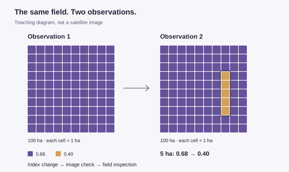
Assume the field is 100 hectares and five hectares change from 0.68 to 0.40. These values do not tell us what happened. In a real review, first check the image date and quality, then compare crop stage, rainfall and recent operations. Send a scout if the change remains unexplained.
- Check the scene. Look for clouds, shadows and a misplaced boundary.
- Check the timing. Establish whether planting, harvest or another operation explains the difference.
- Compare context. Review crop stage, rainfall and recent operations without treating any one index as proof.
- Inspect two areas. Compare the changed area with an unaffected reference area. Record what was observed and what remains uncertain.
- Keep the record. Record the findings against the field, then compare later observations with the inspection and the work that followed.
What NDVI cannot establish
NDVI alone does not identify a pest, measure nitrogen need or prove a yield loss. Sparse vegetation exposes more soil; dense canopies can make differences harder to distinguish. USGS explains the relationship between vegetation reflectance and NDVI. Field interpretation still needs crop and seasonal context.
Sentinel-2 is optical. Cloud can prevent an observation of the field, and its bands have different spatial resolutions. Radar is another measurement, not a replacement optical NDVI image. A coarse overview cannot establish the condition of every individual plant.
NDVI in Planva
The field page in Planva has an NDVI tab with the mean NDVI, the share of the area below 0.3 and below 0.5, and the share of valid coverage.
Read those numbers as a prompt to inspect, not as a verdict. The agronomist decides what work to approve. For a demo, bring a boundary and a field issue your team already investigated, and ask to reproduce the reasoning from observation to inspection. That is a better evaluation than choosing the most colourful map.
Common questions
There is no single value that is good throughout the season. Compare crop stage, scene quality and the same field over time before interpreting a number.
See Planva on your fields
In a 30-minute online session we’ll go through your fields and answer the questions this story didn’t. No sales deck.
No commitment · 30 minutes